GuardOn
Removing blockers to drive adoption
Overview
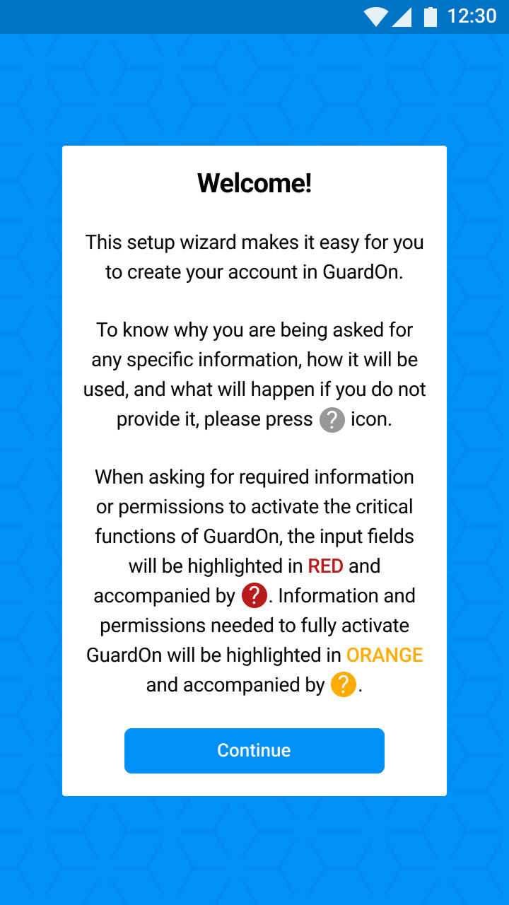
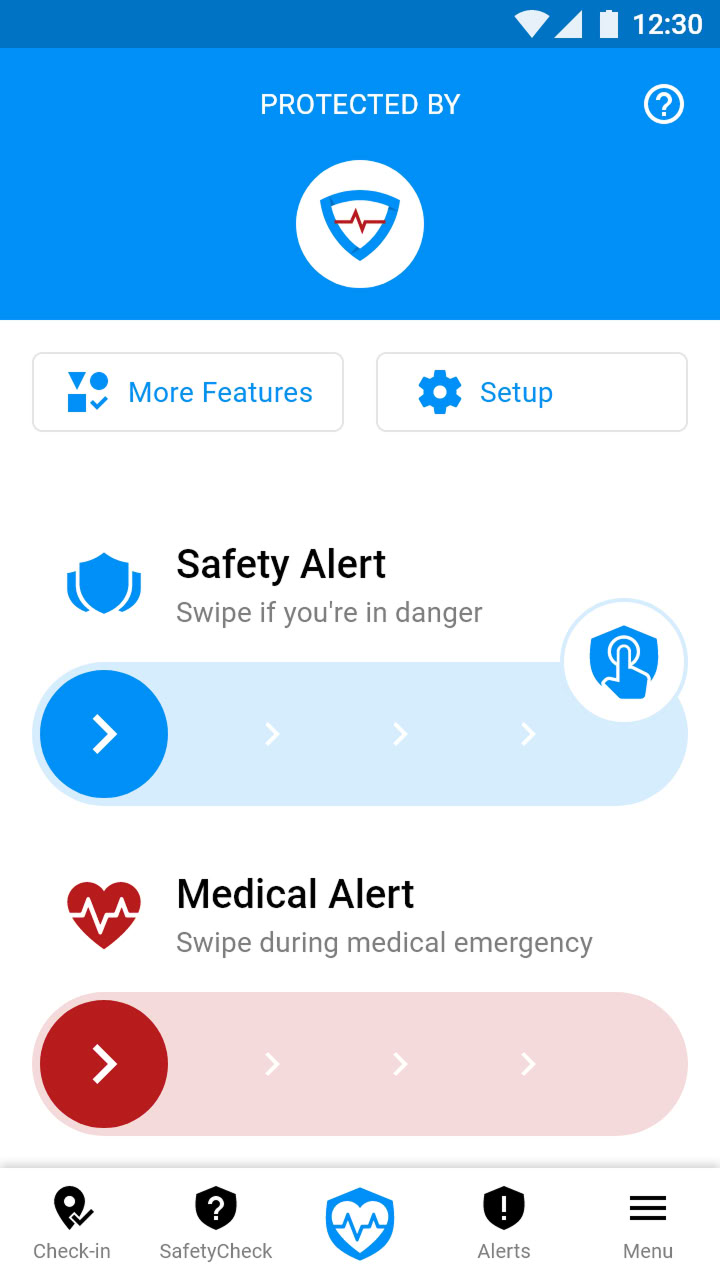
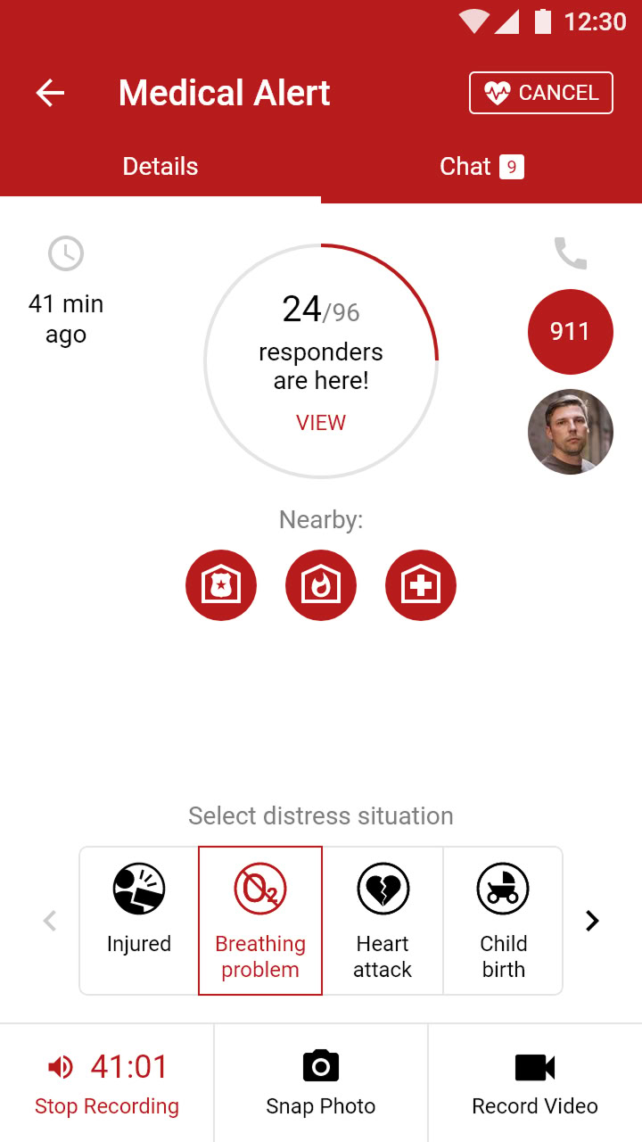
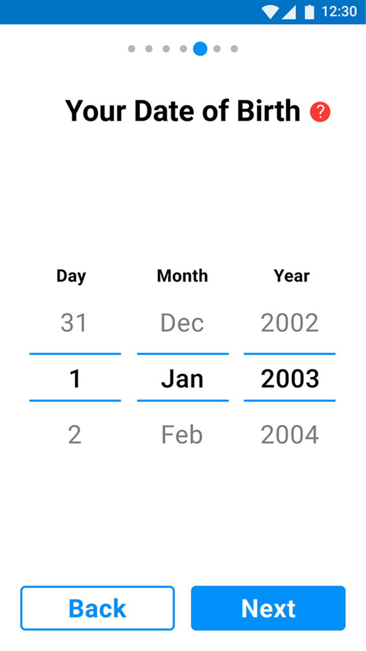
Even with a free app in the market for 3 months, GuardOn was failing to get traction. Talking to and testing the app with people revealed major friction points: long onboarding flow, usability issues, functionality-breaking bugs, and unclear differentiation from built-in SOS features. Additionally, the wearable lacked appeal, reducing perceived value.
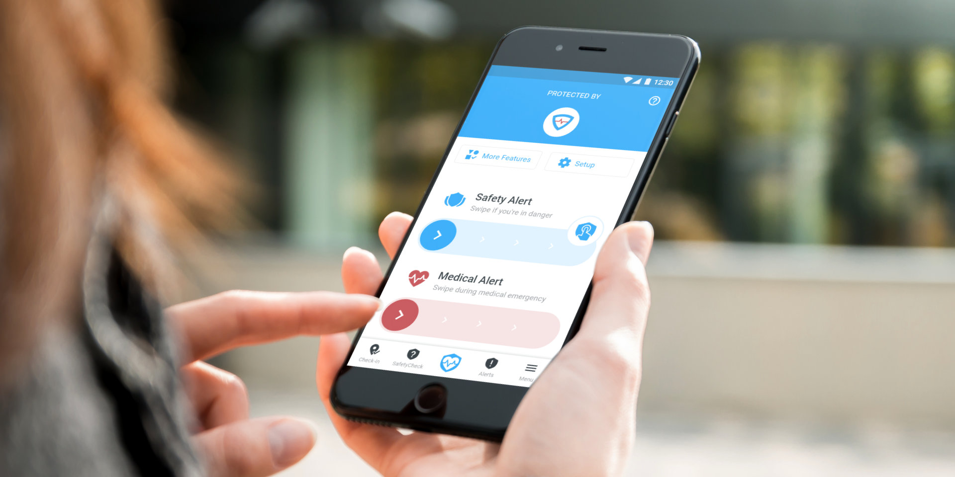
I can simply press the power button thrice to send an SOS quickly. Why do I need GuardOn?
— An interviewed woman
|
Client |
ionidea Inc. (FTE) |
|
My role |
Owned design and research |
|
Worked with |
CEO & Co-founder, Product Manager, and Engineers |
|
Duration |
June 2018 – Q3 2019 (not continuous) |


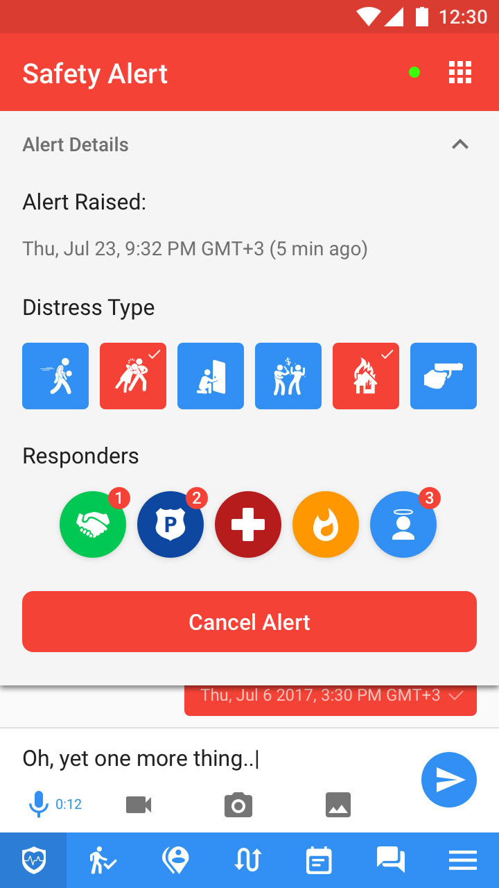
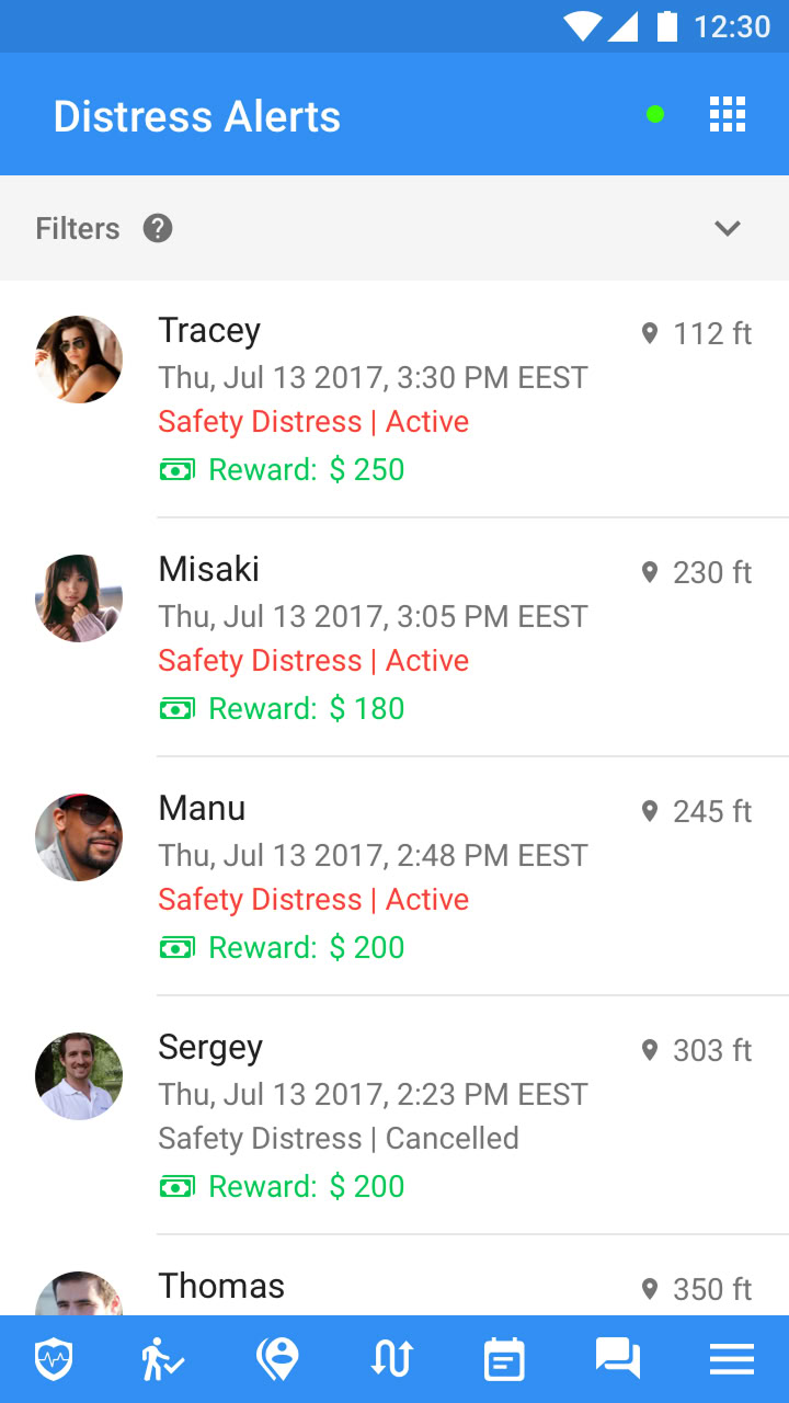
Solution
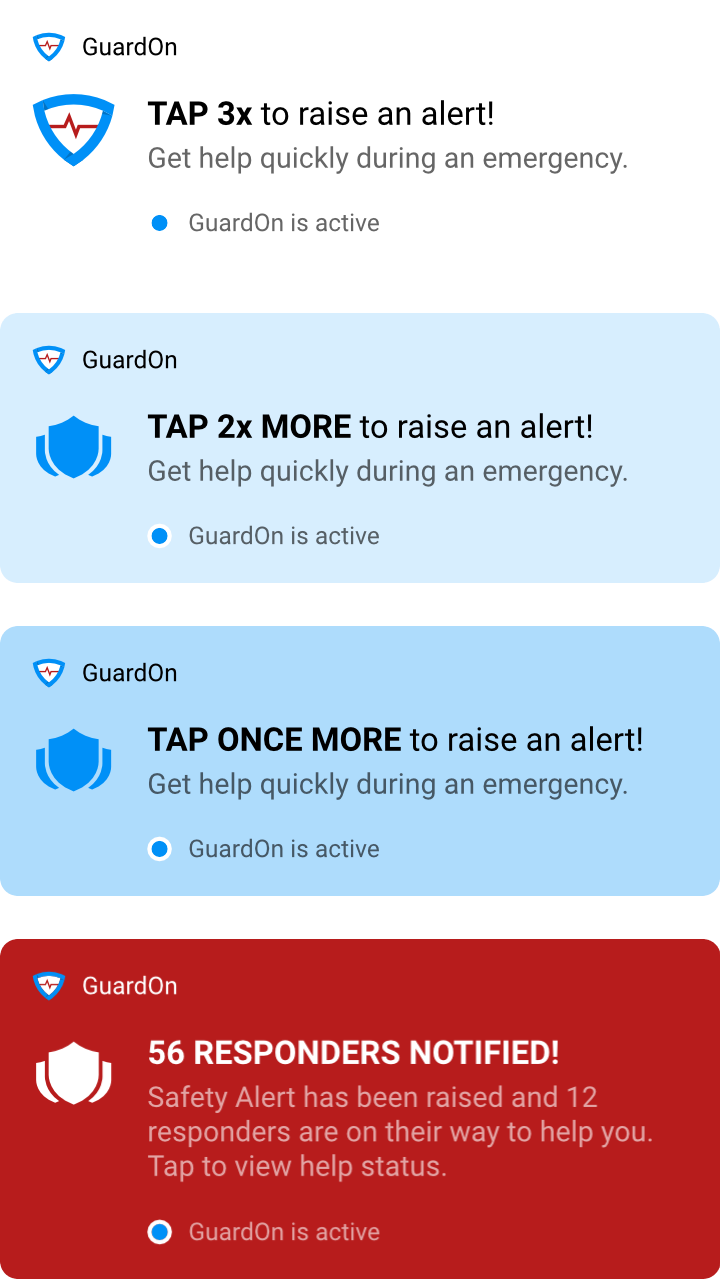
I spearheaded a product-wide UX overhaul focused on reducing friction and enhancing usability by:
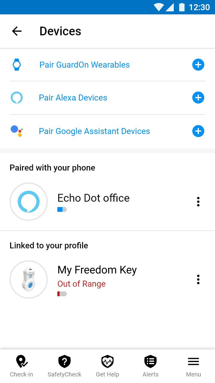
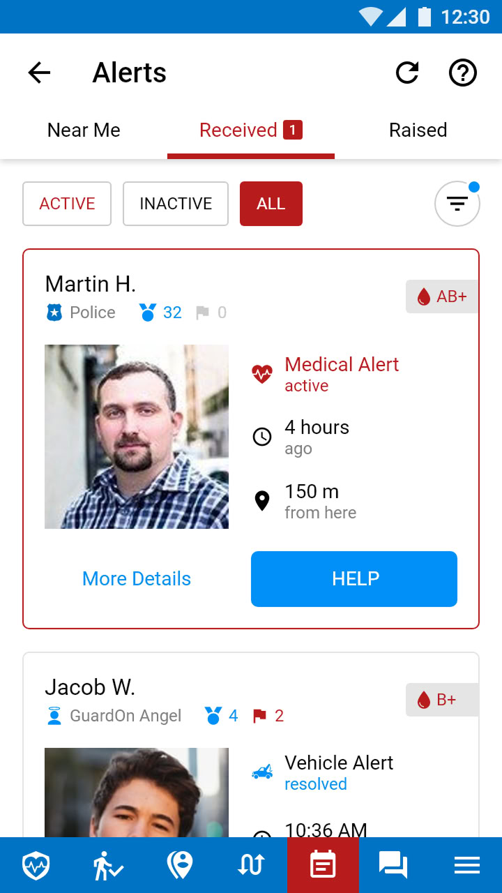
I also pitched a Command & Control Center concept to improve alert monitoring and response co-ordination and offer a comprehensive safety solution for enterprises to protect their staff.
* Changes were implemented in phases, so the screenshots below may show inconsistent intermediate states.
Impact
>20x
growth in userbase
4+
average rating on app stores.
Informed product development and a monetizable differentiator
Improved user experience and reception
The new alert system is much easier to use now.
— An enterprise customer representative
Let’s make
GREAT PRODUCTS!
I’ll ensure the journey is seamless, and the result — impactful